Colour Theory 101: Colour Psychology for Beginners
Russian artist Wassily Kandinsky once said, “Colour is a power which directly influences the soul.” After the year we’ve had, we’re more than ready to feed our souls and embrace a whole new, colourful world. Even if that world is locked down in the four walls we call home.
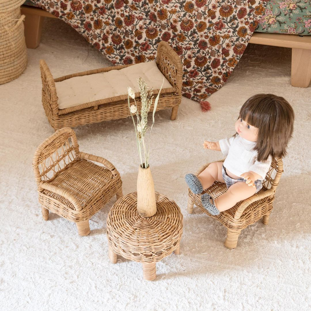
Colour can calm or excite us, evoke peace, or unsettle us. Colour is the boldest personal statement that you can make, so it’s no wonder that picking the hue that fits your personality and displaying it in your home should take top priority. But where do you begin when colour is by its very nature a kaleidoscope of emotional triggers?
Let’s explore.
Why is colour important?
Colours are powerful in how we perceive them. They affect our emotions and how we behave. Colour can be the deciding factor in whether you choose an item of clothing; it sways your thinking and leads to reactions. Think about how you opt for a bright dress to lift your mood. Or how you decorated your workspace in sunshine yellow to inspire energy.
In picking the perfect hues for your home, bear in mind that the right colours can boost your mood, enhance your mental wellbeing and influence how you behave. Put simply; your colour choice is everything!
Colours that excite vs colours that calm
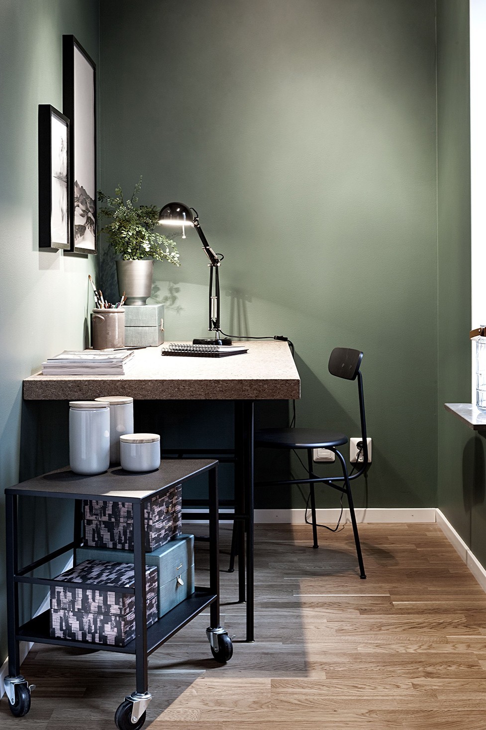
Typically, colours on the light side of the spectrum evoke joy, positivity, balance and peace. Tones that lean towards the dark side of the spectrum, like navy blue, are solid and illicit stability, security and tranquillity.
Exciting colours
- Orange: a combo of red and yellow; this is a fiery hue which prompts action.
- Yellow: this colour is energising and helps to spark creativity and ideas.
- Red: this is an aggressive, passionate and powerful colour. It is typically used to represent romance and seduction.
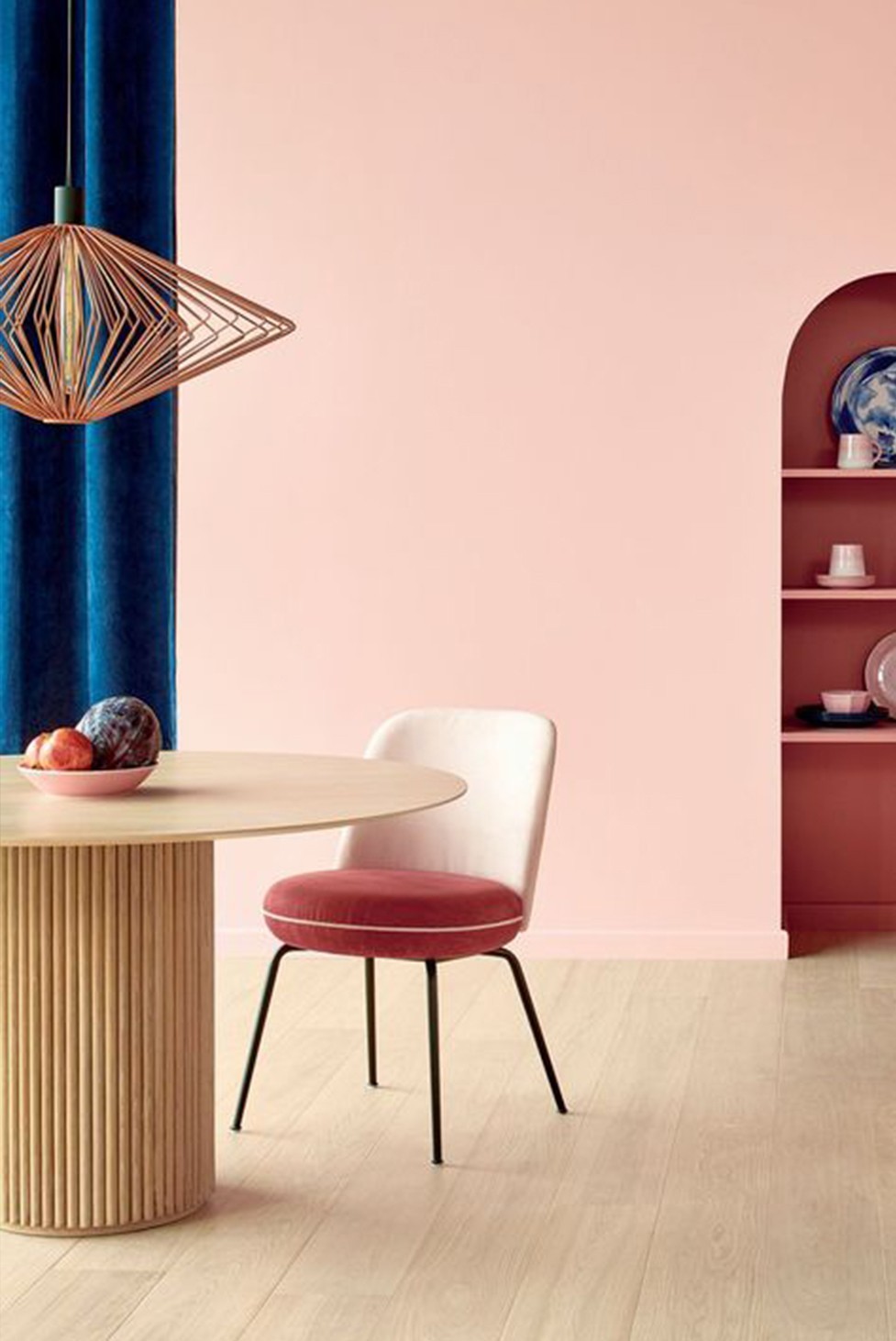
- Pink: feminine and enthusiastic; pink is perfect for sensuality and joy.
- Gold: long considered the colour to represent wealth, gold is luxurious and bold.
Calming colours
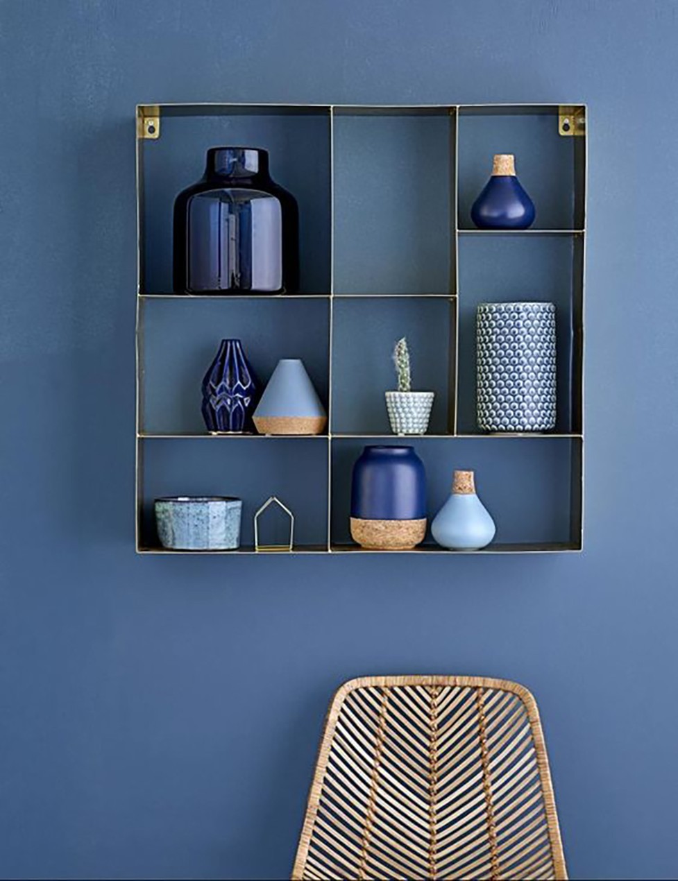
- Blue: just like the ocean helps you feel tranquil and peaceful, blue is the right hue to ease yourself into a calm state as it is a colour that helps you relax.
- White: this pure and gentle colour is considered protective and which reminds of innocence and purity. Perfect for a bedside lamp.
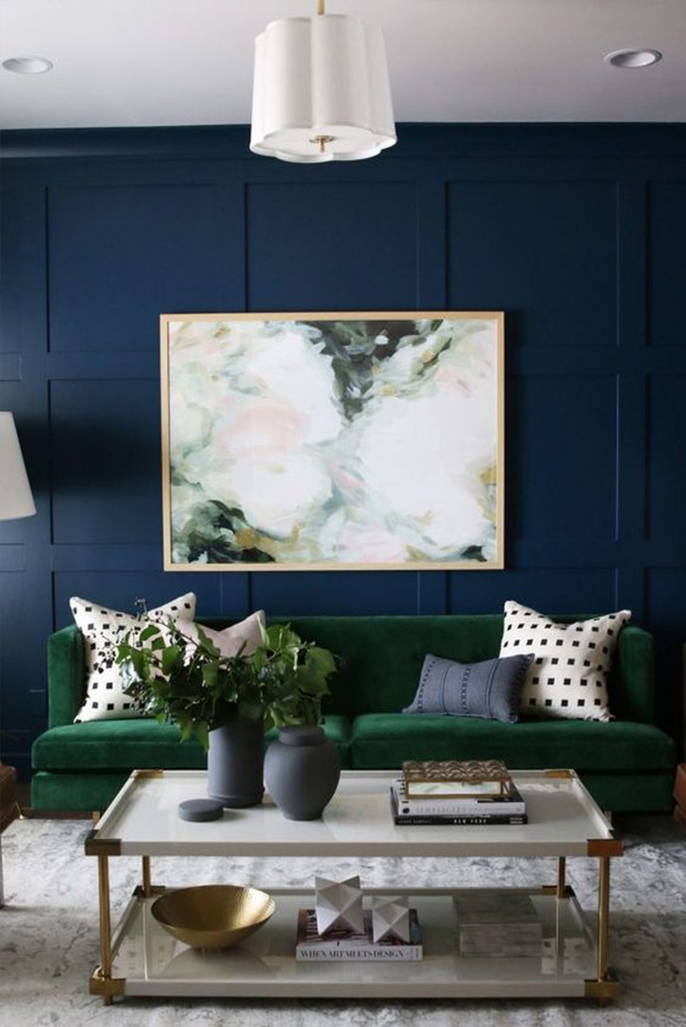
- Green: natural and soothing; green is comforting and invokes a connection to nature.
- Violet: a soft violet can bring inner peace and balance.
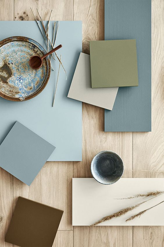
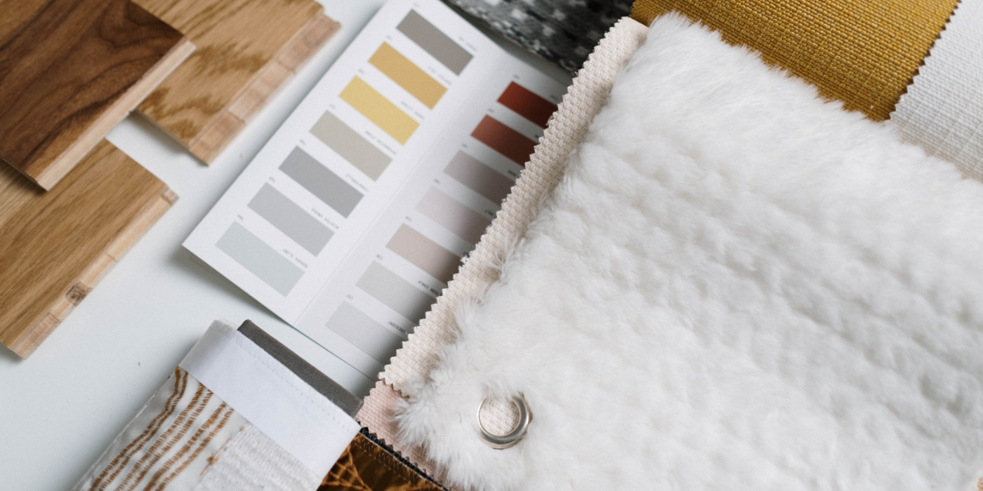
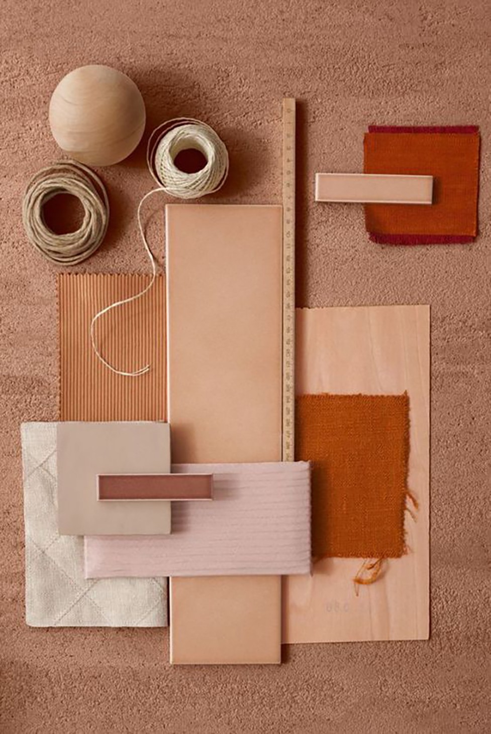
Using colour theory to create a colour palette for your home
Have you seen a colour trend you like and want to upgrade your home to match? Whether it’s classic coastal or newcomer lion brown, the first place to start is the colour wheel.
The colour wheel
The colour wheel is the core of colour theory, which posits that all colours come from one of three primary colours: red, yellow and blue. Primary colours are pure and cannot be created.
Secondary colours (orange, green and purple) are formed when equal parts of two primary colours are mixed. For example: blue and yellow mixed form green. Yellow and red create orange. Red and blue form purple.
Tertiary colours are a mixture, in varying parts, of secondary and primary colours to create different hues. White and black are typically added soften or darken these hues.
Colour schemes
Using the colour wheel, you can create one of four main colour schemes. These are:
Monochromatic: this palette uses the same tones in lighter or darker hues. It needn’t be black and white. You can opt for a blue monochrome approach, in which you use light blues and midnight blues (hues of the same shade).
Analogous: this palette is made up of colours that appear next to each other on the colour wheel, for example, yellow with green or orange, or blue with green or purple. It’s a colourful and soothing palette.
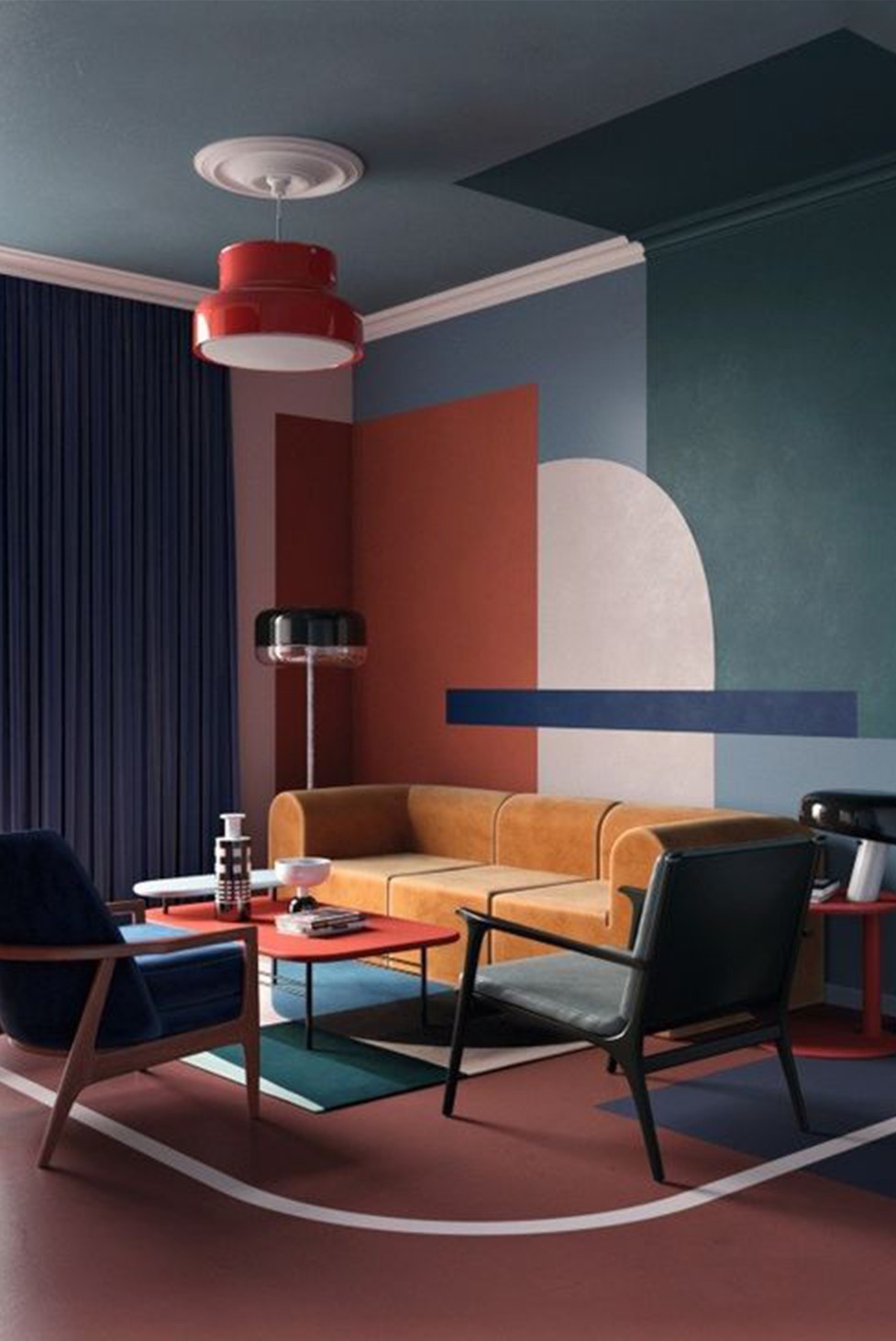
Contrast: this palette is all about drama and energy, using three contrasting colours, such as yellow-orange, green-blue and red-purple.
Complementary: in which two opposing colours are used to create a bold colour scheme, for example, red and green, blue and orange, or purple and yellow.
When colouring your home, as a rule of thumb, aim to use a maximum of five colours – two or three neutrals and 2 or three bold choices. Remember, this is your space, and your creativity knows no bounds, so have fun!
