The Deep Green Colour Trend Reconnecting Us with Nature
Green has most definitely flourished as one of the key colour trends in the last few years.
Stemming from the Pantone colour of the year back in 2017, Greenery, the particular shade a zesty-green, is said to be symbolic of new beginnings – to revive, restore and renew. It’s a colour to convey nature’s greens – to open our minds to green in a broader context. Ultimately looking at greenery – not only as a colour but an ideal – reconnecting with nature and the great outdoors.
“Greenery symbolises the reconnection we seek with nature, one another and a larger purpose.” Leatrice Eiseman, executive director Pantone.
Green is indicative of hope – the anticipation of things to come. The expressions “greener pastures” and “grass is greener” are used in reference to something newer or better.
A Fresh Start
The Pantone colour of the year is closely watched and directly influences product development in multiple industries – from fashion to interior design and branding – no surprise that there would be a surge in green.
Dulux’s colour of 2020, Tranquil Dawn, which sits somewhere between green, blue and grey – just like the fleeting beauty of the morning sky – is described as “new dawn, and a fresh start to a new decade.”

Nature’s favourite colour
Behr is also backing green with Back to Nature, encouraging us to embrace the spirit of discovery. As nature’s favourite colour, Back to Nature is described as a restorative and revitalising green hue that engages the senses and pairs well with other colours both inside and outside your home.’
Whereas Graham & Brown announced Adeline as their new colour of the year – opting for a considerably deeper, rich bottle green “whose natural qualities work perfectly with most other colours.”
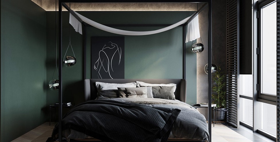
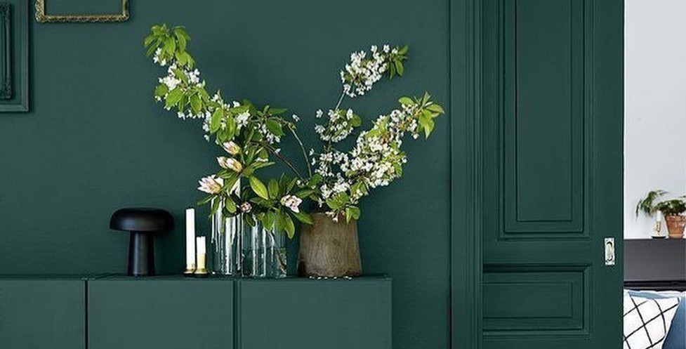
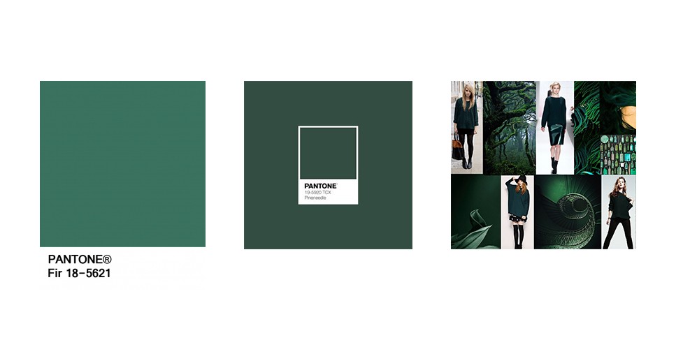
Forest Green
The name itself sets the scenery: dark aromatic depths of dense forest and forage for fabulous fir greens. A dark green commonly found in nature, it evokes visions of dense woods, thick bushes and tall trees.
A perfect colour for lovers of dark interiors but with green being classed as a ‘new neutral’ it also falls into the neutral/natural feel too. There are many ways to incorporate dark green – the power of paint, simply painting a wall deep green, products and soft furnishings to even bringing plants inside. Combining blue and green together in a palette represents nature, water and the new growth of the forest.
The Psychology of Green
Green has two paradoxical meanings – on one hand suggesting nature and the environment, and on the other commonly associated with money, wealth, prestige and greed. We refer to someone with a touch of the “green-eyed monster” as a jealous person and you may have heard the phrase “green with envy” which refers to jealousy.
But if you bring it back to balance and harmony, green is thought to be the greater balancer of our mental, emotional and physical energies. Green is rejuvenating as a colour. It revitalises us when we are physically, mentally or emotionally exhausted. This is why there is so much of this relaxing colour on the earth, and why we strive for it to stay that way.
Green is an emotionally positive colour, that gives us the ability to love and nurture ourselves and others unconditionally. As a colour, it taps into our nurturing nature – because of its link with the heart. Green encourages us to nurture others but it is also nurturing to us.
Biophilia
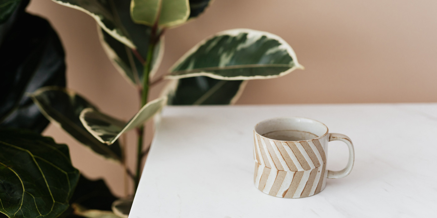
Biophilia means the love of nature. Focusing on our innate attraction to nature and natural processes, biophilic design is a way of innovatively designing and incorporating the natural world into the places we live, work and learn. Note how there has been a huge rise in bringing plants indoors. We have seen indoor plant sales boom in recent years, not only does this tie in with this design trend but it is also a reflection of urbanisation. As a nation, we are increasingly living in tight spaces in cities where access to nature is limited.
Green encourages us to blur the boundaries between inside and outside and create a sanctuary of wellbeing.
Written by Lynessa Hancock
You Might Also Like
-
 23, Sep, 2021Conscious Luxury: Practising Responsible Consumerism
 -
 25, Aug, 2021Colour Theory 101: Colour Psychology for Beginners
 -
 06, May, 2021Buy Plants Online: Your Guide to Choosing Houseplants for Your Home
 -
 24, Feb, 2021Mood Board: The Future is Earthy
